The Challenge
Invictus is an agency based within the sales industry that’s focused on heavy growth and development within their business.
Invictus means ‘unconquerable’ in Latin and is a testament to the team and the mindset within their company culture. Therefore, the firm needed a logo that stood out, looked modern, yet also solid – as so to stand up to what it represents.
Enter Brandlective, who’s job it was to really make the brand come to life and create a visual narrative that really shows the character of the brand.
The Solution
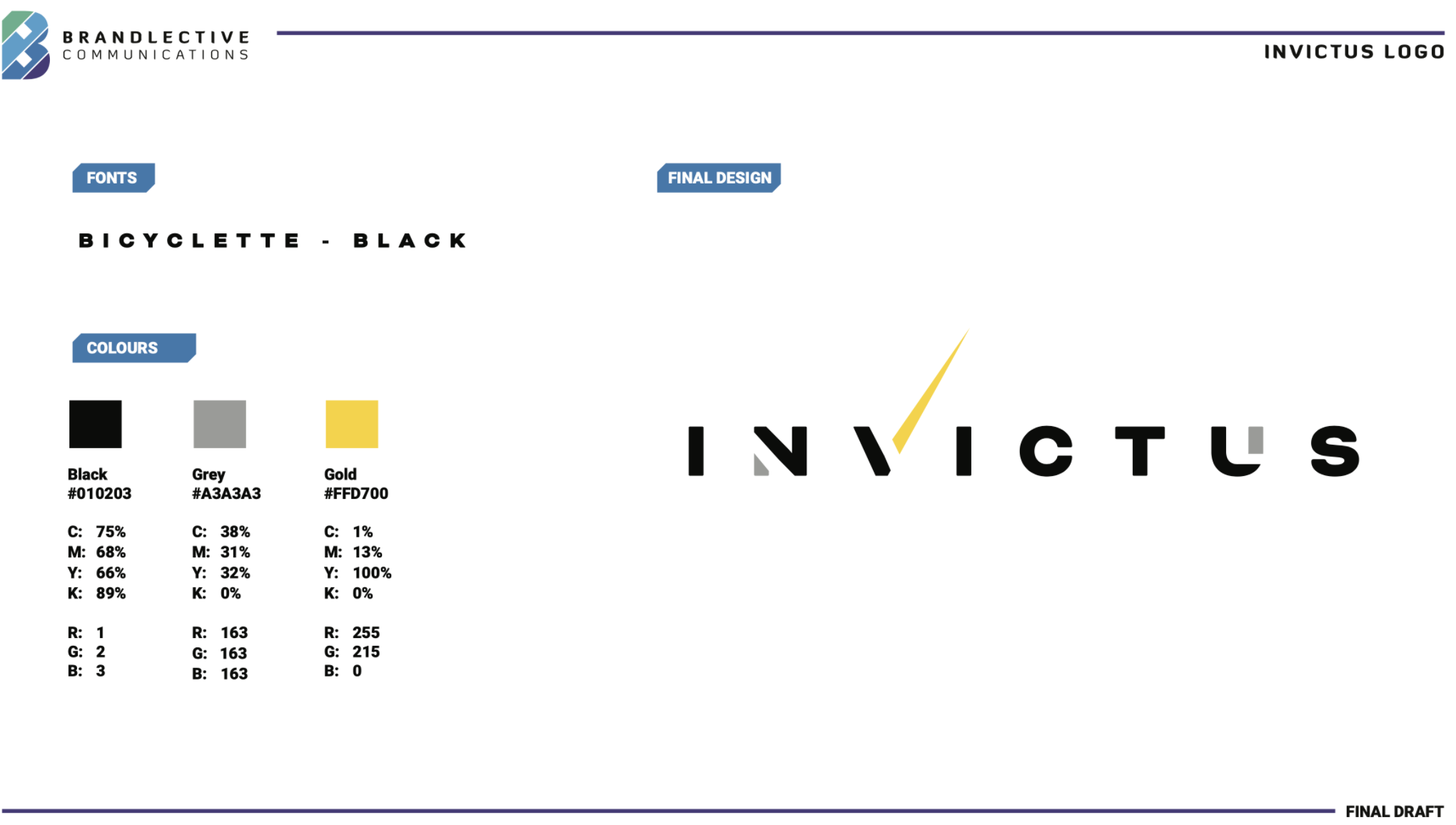
We really wanted to focus on how ‘strong’ the wording could be which is why we decided to go with a solid display font. Not only does it stay fresh as a sans serif font but is also classy.
Introducing the extended element of the ‘V’ gives the design an eye-catching vehicle to ‘stand out’ and also looks like a tick mark – something that also derived from ancient Latin in another meaning.
The deep and juxtaposing bold colours keep the design solid and focused. The point is for it not to be too flashy or convoluted, but to give a sense of strength and timelessness – something that has been executed particularly well here.

The Result
As with most projects, it was extremely important for Invictus to be with us at every step of the way and working closely with the design department at Brandlective. This is something that almost always pays off well in the long run.
The execution and final design is a solid typographic mark overall and fits exactly what the brief set out to accomplish.
Since we have completed this project, Invictus has worked with Brandlective on a number of other projects. A partnership we are happy to share!
210
Logos created
Brandlective create logos for your business to be at the top of your game.
#1
Marketing Firm
Brandlective hires top graphic designers for our team to get you the best logo possible.