How Did We Help Our Client Stand Out?
Spark Branding, a dynamic and innovative branding agency, approached us seeking an external perspective for their new logo design. Renowned for pushing boundaries and crafting extraordinary experiences, Spark Branding needed a logo that encapsulated its mission to captivate, inspire, and leave a lasting impact. Their existing website featured a dark grey aesthetic, and they requested the integration of terracotta and dark mint green as primary colours to complement their brand identity.
The Solution
To create a logo that would reflect Spark Branding’s unique approach and resonate with their target audience, our design team embarked on a collaborative and iterative process. We focused on crafting a design that was visually striking and aligned with their brand ethos.
1. Understanding the Brand
We began by delving into Spark Branding’s core values, mission, and tagline: “Ignite your audience and illuminate the path to success.” This understanding was essential to ensure the logo would effectively communicate their brand’s dynamic and innovative nature.
2. Concept Development
Our design process included several key elements to capture the essence of Spark Branding:
- Colour Selection:
- Terracotta: Chosen for its warm and earthy tones, terracotta represents creativity, energy, and a grounded approach. It conveys a sense of innovation while maintaining a connection to the real world.
- Dark Mint Green: This colour adds a refreshing and modern touch to the design, symbolizing growth, creativity, and balance. It complements the terracotta, creating a visually appealing contrast that aligns with the agency’s innovative spirit.
- Symbolism and Imagery:
- We incorporated elements that evoke the idea of a spark and illumination, aligning with the agency’s tagline. The design elements were crafted to symbolize the ignition of ideas and the illumination of new paths.
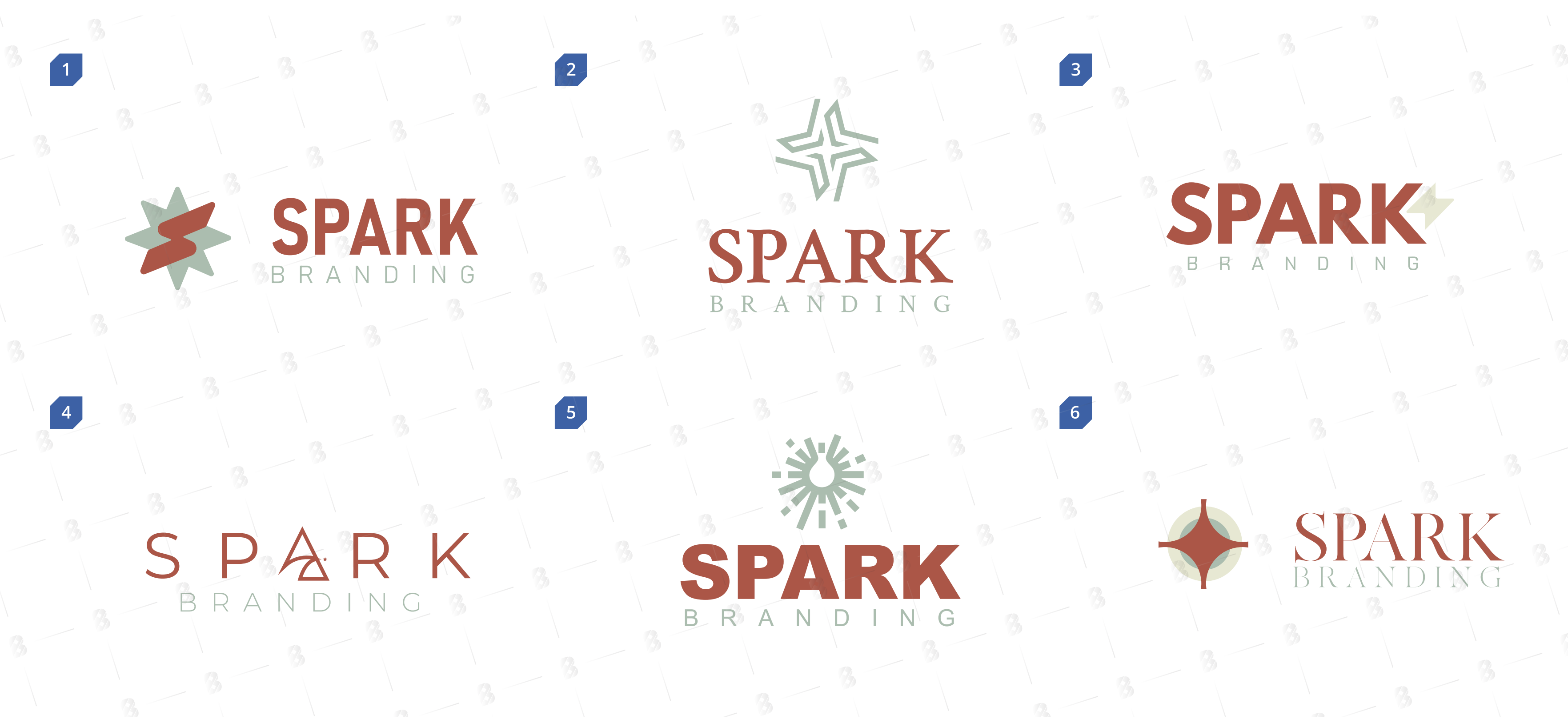
3. Design Refinement
After presenting initial concepts to Spark Branding, we gathered their feedback and refined the design to better align with their vision. Adjustments were made to ensure the logo was versatile, scalable, and consistent with their dark grey website aesthetic.
4. Final Design and Implementation
The final logo design for Spark Branding features a bold and modern aesthetic, with terracotta and dark mint green as the primary colors. The design includes a stylized spark, symbolizing the ignition of creativity and ideas. The logo is complemented by clean and contemporary typography, ensuring a cohesive and professional look.

The Result
The new logo for Spark Branding successfully achieved its goals, providing a powerful visual identity that resonates with its audience and enhances its brand presence:
- Positive Client Feedback: Spark Branding was thrilled with the final design, appreciating how it captured its essence and aligned with its innovative approach.
- Enhanced Brand Recognition: The striking colour combination and symbolism in the logo helped Spark Branding stand out in the competitive market, facilitating greater brand recognition.
- Versatile Application: The logo was designed to be versatile, ensuring it could be effectively used across various mediums, including digital platforms, print materials, and experiential marketing campaigns.
- Cohesive Brand Identity: Integrating terracotta and dark mint green with the existing dark grey aesthetic provided a cohesive and visually appealing brand identity, strengthening Spark Branding’s overall presence.
By collaborating closely with Spark Branding and leveraging our expertise in logo design, we created a logo that reflects their dynamic and innovative nature and sets the stage for their continued success in the branding industry.